
Case study
Trame
A family app that brings together a household's calendar, groceries, tasks, meals, notes and expenses.
Shared between adults and children.
- Status as of October 8, 2026
- iPhone: version 1.0 submitted to the App Store, under review by Apple. Web: usable. Android: planned, on hold.
- Technologies and topics
Screenshots
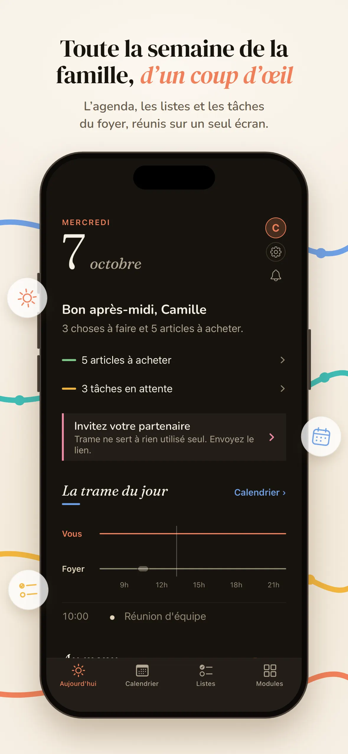
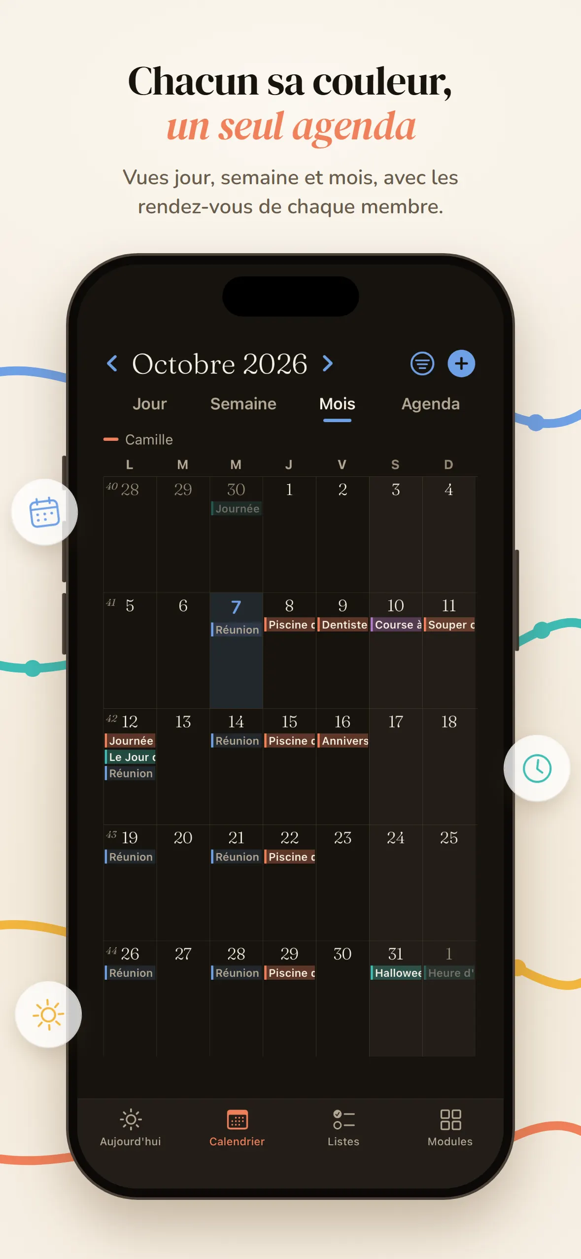
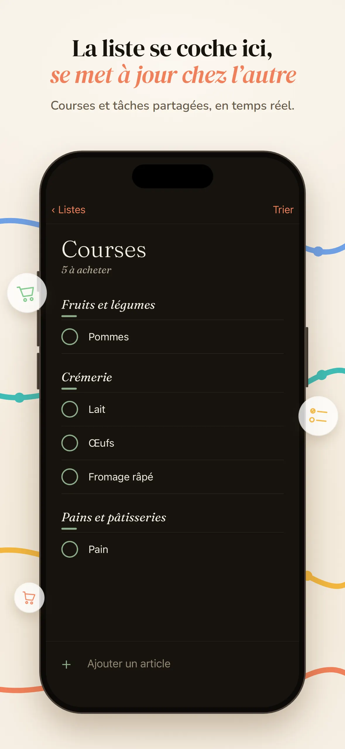
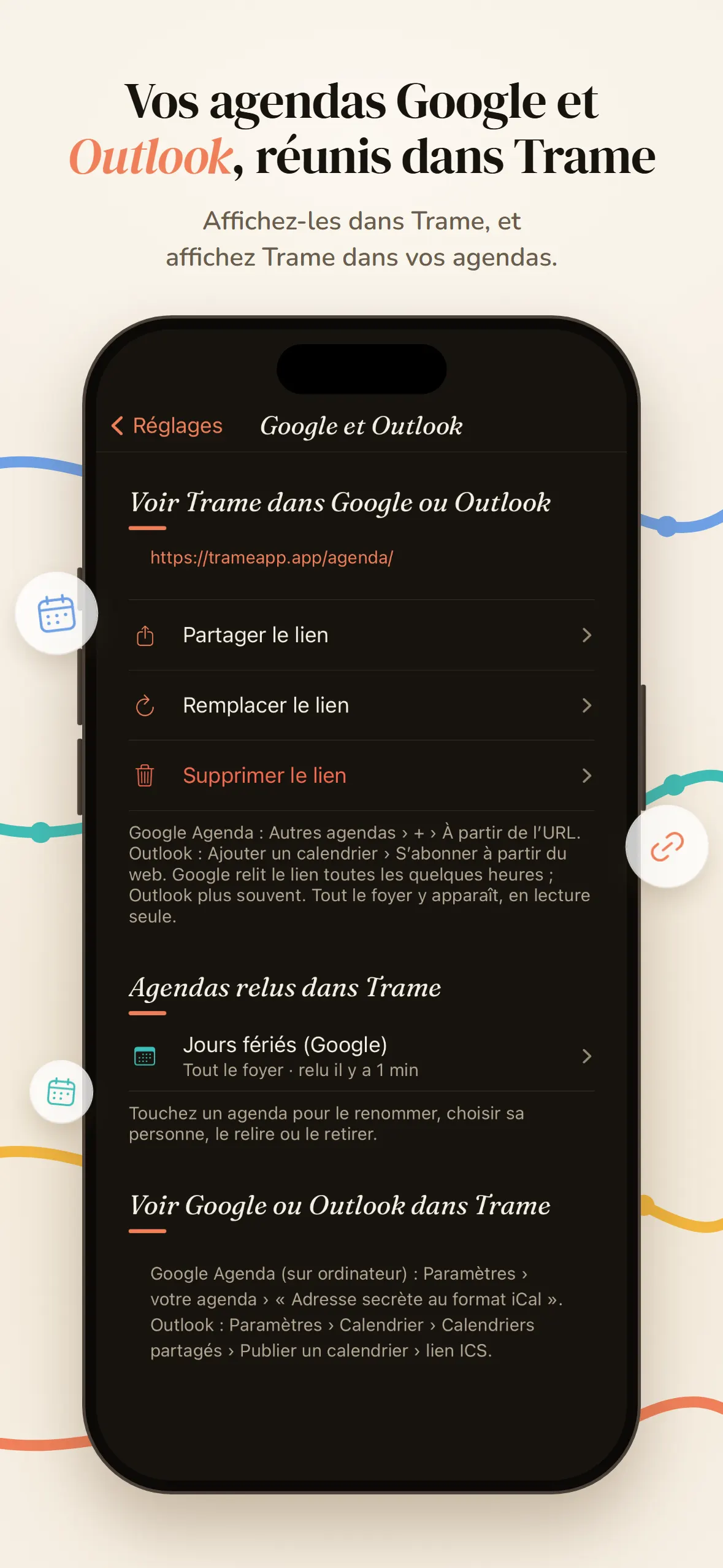
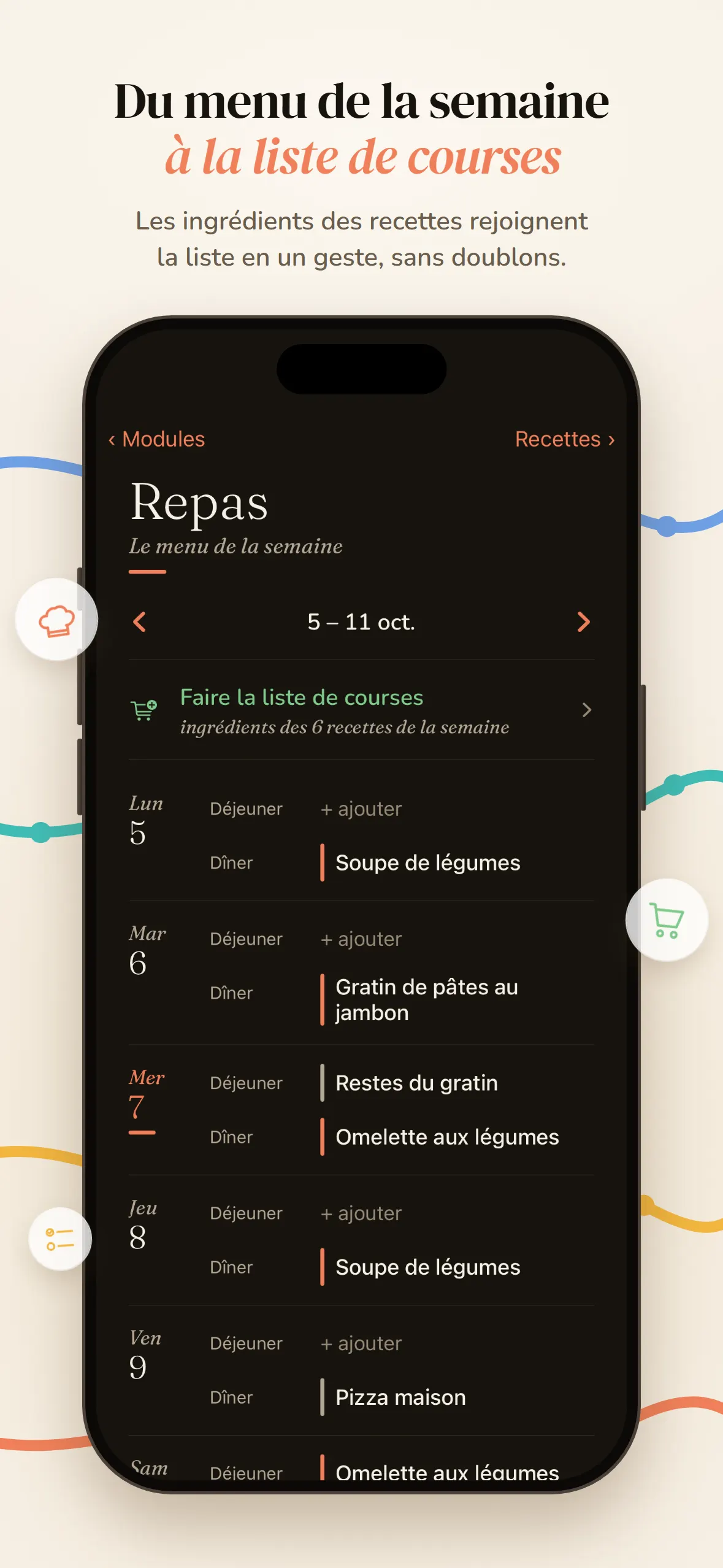
Presentation visuals of the app on iPhone: real interface, fictional household “Famille Martin”, no real data.
Presentation video
Problem
A family’s logistics are scattered: messages, paperwork, separate calendars (work, school, couple). Everyone sees part of the week; no one sees the same one.
Solution and features
One place, the same week for the whole household. Intended audience: couples and families, adults and children. Interface 100% in French.
- Family calendar: one color per member, day, week and month views, recurring events, reminders.
- Google Calendar and Outlook: the work calendar shows up in Trame (read-only link), and the household calendar shows up in Google or Outlook (
.icssubscription). - Lists and tasks: the shopping list is checked off in the store and updates live for the other person; tasks have a person and a due date.
- The rest of the household: notes, the week’s meals and recipes, shared expenses, school timetable, messages and documents.
- Notifications: you are notified when someone close adds an appointment.
- Privacy: no ads, no trackers, no resale of data, no password (one-time code by email), immediate account deletion.
My decisions
The product is mine, from the first idea to the App Store submission. Among the decisions I made:
- Name and identity: I dropped the first name, FamilyHub, too close to an existing app. I kept the idea of weaving and rejected the first graphic proposals as “too school-like”.
- Product: I removed the family / work / personal split, which was inferred from the selection of members. I asked for custom recurrence, synchronization with Outlook and Gmail, checkable list items, the same level of design on computer and mobile, and words cut off sharply instead of ellipses.
- Security: I asked for the security to be hardened, then for a new audit after features were added.
- Release: I chose the countries of release and the data region (Paris).
- Apple review: I handled it myself (screen recording on iPhone, test account for the reviewers, reply to Apple).
I test on a real phone and report defects with screen recordings.
Technical choices
Security
- Row-level security (
RLS): a household never sees another’s data. Supabase (PostgreSQL), 26 replayable migrations. - Session encrypted on the device:
AES-256, key in the iOS Keychain. - No secret key in the code.
- Privacy policy checked against the actual code.
- Passwordless sign-in: one-time code by email.
App and services
- App: Expo (SDK 57) and React Native, TypeScript,
expo-router. One codebase for iPhone, web and Android. - Data and accounts: Supabase (PostgreSQL, one-time-code authentication, file storage).
- Sign-in emails: Brevo. Notifications: Expo’s notification service to Apple (APNs). Site, web version and hosting: Cloudflare.
- Quality: about 340 automated tests; type checking (TypeScript) on every change.
- Build and release: EAS Build (Expo) to compile the iOS app, TestFlight, App Store Connect.
Design
Serif typeface Fraunces in the app and the videos, DM Serif Display for the title of the presentation video. Sober palette, automatic light and dark mode. Icon: interlaced colored lines on a dark background. The animated videos (App Store preview, social media, site loop) are built in code, in the repository’s motion/ folder.
Working method
I define the product, I decide and I test. Writing the code is entrusted to several AI agents (Claude), each with a defined territory:
- a main agent (iOS, web, database);
- an Android agent;
- a motion design agent;
- a coordinator who distributes the work, checks deliveries and maintains the documentation (
HANDOFF.md).
Rules enforced: one territory per agent, never a global commit, a single push to GitHub, a check before every delivery.
I decide, I check every delivery and I test on real phones. The code is written by AI agents; it is not hand-written code.
Current status and links
- iPhone: version 1.0 submitted to the App Store, under review by Apple (sent on October 7, 2026). Available for testing through TestFlight. Target countries: Canada, France, Belgium, Luxembourg, Switzerland. Free.
- Web: usable version at trameapp.app/app; presentation site at trameapp.app.
- Android: planned, deliberately on hold (Google Play first requires 12 testers).
Link: privacy policy.

